Bassett’s 2026 Colors of the Year
Updated 01/15/26
One of the highlights of the design industry is the Color of the Year announcements. Yes, there is a lot of hoopla around these insights and prognostications. But, aside from the excitement, what does this mean for you in your home or design plans?
It’s good for you to know that there’s as much thought, science, research, and brand alignment that goes into the colorations of our products as into the foundational product design itself. That’s why a lifetime of designing with Bassett products helps you continue to stay true to your personal style while enjoying the fun of exploring the new.
In spite of what has felt like an era of fatiguing micro trends, Bassett has maintained a through-thread of color sensibility over the years. We’re committed to the quality of heritage design while also offering you products that allow you to refresh your style in as grand or restrained a way as suits you. So, we’re inviting you into our style lab to explore our color-planning for 2026 and the second half of this decade.
An Organic Foundation of Timeless Appeal
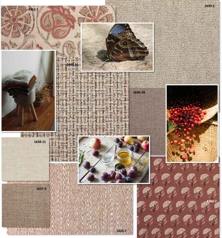
From the offering by Sherwin-Williams of their “approachable and versatile neutral, Universal Khaki” to Pantone’s pronouncement of a “billowy, balanced white “Cloud Dancer,” we can see a general resetting of the color wheel to a more organic foundation of timeless appeal. The other paint companies don’t stray far from this path of nature-based colors: Benjamin Moore’s shadowy “Silhouette,” Behr’s color-shifting smoky jade called “Hidden Gem,” Valspar’s “Warm Eucalyptus,” and Glidden’s “Warm Mahogany” among them. What’s most interesting to note is how this conversation dovetails with Bassett’s always-evolving-but-never-shocking color range. There is a time and a place for trends, but trend-right – where your home always feels fresh and welcoming – is how we help you stay at-home chic and comfortable day after day, year in and year out.
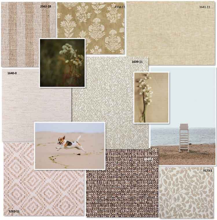
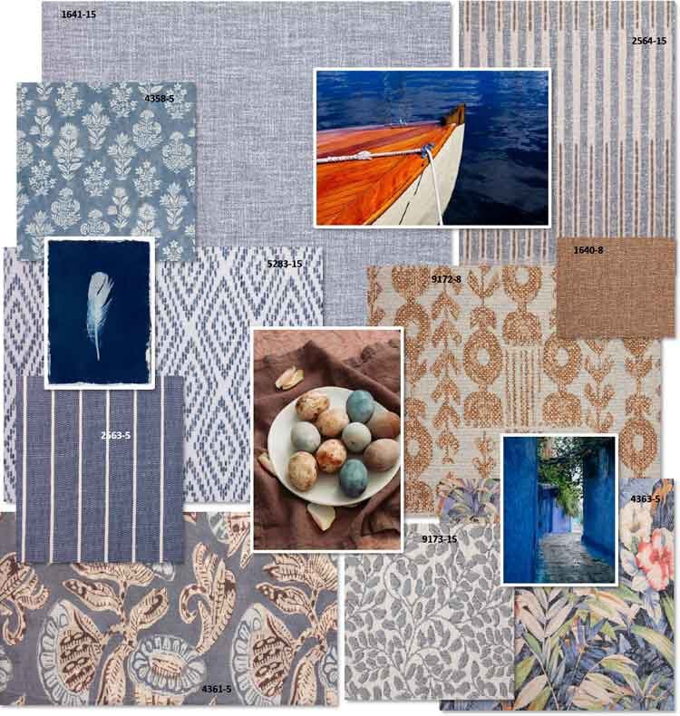
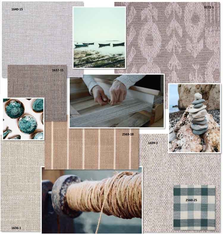
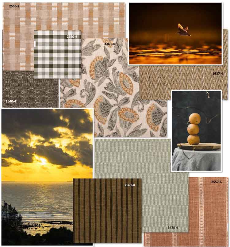
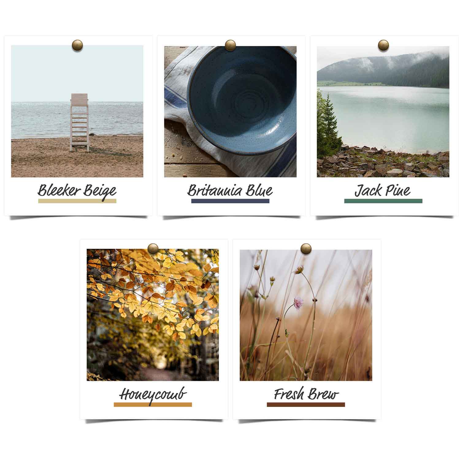
Here, then, are our Bassett Colors of the Year – for your design glee and for your enduring home-sweet-home comfort.
Welcome to the palette of 2026 and beyond – colors to ponder, seek a special resonance with, and add to your nest of collected-over-time colors and furnishings.
